Websites that Master Color Coordination
Close to Nature
This earthy combination of green with a range of blues, from pale cerulean to teal blue, is perfect for conservative designs intended to project an image of stability, reliability and abundance.

Bright Pink and Pastels
This lively site brings together a bright raspberry pink with softer colors such as pastel blue and light pastel purple. The result is a wonderfully fresh and lighthearted color scheme.

Unique Combination
This unlikely blend of a range of dark pinks with a blues makes this a unique and engaging combination that can be used for a range of projects in different fields.

Modernity in Full Bloom
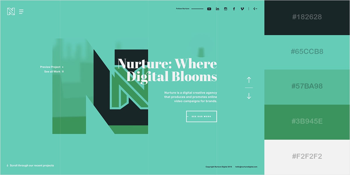
This combination of ocean green, aquamarine and sea green perfectly communicates the concept of modernity and at the same time, life and fertility, which is totally in sync with some of the words in the site’s central message: digital, nurture and bloom.

Effective Accent Colors
This is another example of a site that effectively uses a bright accent color to delineate a path for the viewers’ eyes. In this case, the bright yellow draws the eye first to the title, then the path up the mountain and finally to the call-to-action buttons at the bottom of the page.

Youthful and Fun
This playful and colorful scheme combines several vibrant hues: bright turquoise, tangerine yellow and dark orchid.
Gorgeous Contrast
This sleek and ultra-modern site boasts an elegant and eye-catching combination with effective contrast. The bright yellow-green combines well with the black and gray in the background.

Vibrant and Elegant
This bright and elegant color scheme brings together a very saturated light cold blue with other shades, such as dark slate blue and pale cornflower blue. This combination is elegantly complemented by a bright and vivid shade of pink.

Clean and Modern
A beautiful myrtle green and keppel come together here with azureish white and plain white in a simple but effective combination.

Blue and Refreshing
A range of blues, from a bright lapis lazuli blue to aqua blue, make this a reserved yet beautiful color scheme. It can be used in a variety of different visuals, from muted corporate projects to design-related ones, as in this case.

Corporate and Traditional
If you’re looking for a more muted and corporate look, this color scheme brings together shades of green, blue and brown that convey both professionalism and reliability. Phthalo Green, dark slate gray and pewter blue are just some of the colors used here.

Innovative and Audacious
This in-your-face combination of Portland Orange, vivid yellow and jade on a dark gray, almost black background screams for your attention. Daring and full of energy, this color combination is perfect if you’re going for a contemporary and audacious look.

Clean and Energetic
The shades of blue and violet in this site are especially pleasing to the eye and evoke both energy and peace at the same time. Blueberry and sky blue are artfully combined with amethyst to give life to a refreshing and eye-pleasing color combination suitable for any design which aims to incite positive emotions.

Texturized and Dynamic
Dark sienna, charcoal and a burst of pale red violet make this color scheme a must-have for those looking for an elegant, futuristic yet dynamic look and feel. This color combination is versatile enough it can be used in projects ranging from modern-looking corporate reports to magazines and editorial content in general.

Vivid and Sharp
Dark cerise, royal purple and dark slate blue are blended in this beautiful and engaging site. The deep cerise acts as an accent color over the dark purple background, leading the viewers’ eyes to the navigation menu as soon as they arrive on the site.

Minimal Yet Warm
Eggshell white, dark vanilla and taupe gray with jelly bean red highlights come together in this minimalist yet warm and inviting site. The burst of energetic color throughout the design makes this site elegant and inviting at the same time.


