

Best 20 Logo Design Color Combinations
Beige with a red gradient
This red gradient paired with black text and a beige background maintains a highly professional feel. A great fit for tech businesses, the red gradient establishes seriousness and professionalism.
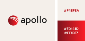 Hex Codes: Beige #F4EFEA, Red Gradient #7D141D + #FF1E27
Light purple, mint, and butter
A triadic colour scheme is used in this logo to produce a gentle yet dynamic impact. Yellow and lavender purple go well together, and the accent colour of green provides just the right amount of flair. This lovely pastel logo has colours that are clearly spring-inspired!
 Hex Codes: Purple #AA96DA, Mint #C5FAD5, Yellow #FFFFD2
Grey & green gradient
Our eyes are accustomed to seeing different shades of green, much like in the natural world. Your design will be alive and vibrant when you use a green gradient on a white background. like the aroma of just mowed grass
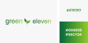 Hex Codes: Grey #F7F7F7, Green gradient #006838 and #96CF24
Royal blue & pale yellow
This logo combines a delicate butter-yellow hue with royal blue. A very professional hue, royal blue is ideal for the legal, financial, and technology sectors. This pair of complimentary hues arouses feelings of stability, reliability, and history.
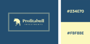 Hex Codes: Blue #234E70, Yellow #FBF8BE
Pink with a purple gradient
Anybody’s attention may be quickly captured by a vivid purple gradient. Purple conveys creativity, joy, and intelligence in addition to kingship, wealth, and power. Your logo will appear balanced and opulent when matched with a lighter shade of a like hue. Pink and purple may appear to be a young couple of colors, but a gradient helps to mature the impression and provide a touch of modernity.
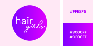 Hex Codes: Pink #FFE8F5, Purple gradient #8000FF and #DE00FF
Black & gold foil
Gold foil is a favourite of everybody! A highly classy and stylish colour combination is black and gold. The colour combination looks wonderful in print materials and is both contemporary and inviting.
 Hex Codes: Black #191919, Gold #B88746 and #FDF5A6
Pink & red
This pallet of red and pink colours is similar. It retains a high enough contrast while still being soft and quite contemporary to be completely readable. If the tones of pink and red are maintained far enough apart to establish a visual hierarchy between them, they complement each other remarkably well.
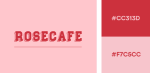 Hex Codes: Red #CC313D, Pink #F7C5CC
Royal blue & lilac purple
We adore this comparable colour scheme that achieves harmony with rich royal blue and delicate lavender purple. This striking duo might be used to practically any sector. Royal blue is a dependable colour for any company that conveys stability and endurance. While gentle purple lightens the atmosphere and gives the emblem a feeling of balance.
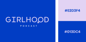 Hex Codes: Purple #E2D3F4, Blue #013DC4
Eggplant & yellow gradient
This colour scheme is incredibly regal. Although yellow and purple make the ideal complimentary colour combination, the gradient in this case gives the logo design a whole new level of depth. This gradient is incredibly warm, fusing yellow and orange to create a deep, honey-colored gold. Very inspiring and ideal for a wellness company!
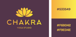 Hex Code: Eggplant #533549, Yellow gradient #F6B042 and #F9ED4E
Fushia & neon green
What a fantastic colour combo, right? This logo is striking due to its use of fuchsia, neon green, and other contemporary cyberpunk hues. Since pink and green are complementary hues, they go well together, and their intense saturation creates the type of energy you’d expect from a spin class.
 Hex Codes: Green #99F443, Pink #EC449B
Black & silver
You could wonder what hue works well with silver. Black is the only colour that works. The best neutral colour to let a silver foil shine is black. Black and silver are a highly sophisticated colour combination since they are both stern, professional, but mysterious and enticing.
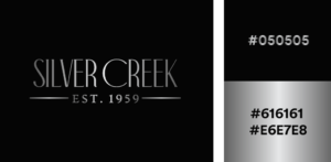 Hex Codes: Black #050505, Silver gradient #616161 and #E6E7E8
Peach & burnt orange
Here is an equivalent colour theory-based monochromatic colour scheme. The backdrop is a quiet peach that gives way to the burned orange colour. This colour combination succeeds because the two tones are kept in harmony. There is no competition for attention between the two since one is stronger than the other.
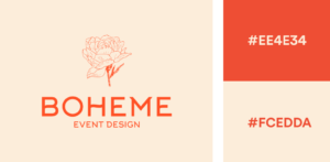 Hex Code: Orange #EE4E34, Beige #FCEDDA
Navy & orange gradient
This logo creates a strong impression by combining the complimentary hues of blue and orange with a gradient. The usage of an orange gradient to delineate a mountain range keeps it professional and aesthetically appealing.
 Hex Codes: Blue #072C50, Orange gradient #B88746 and #FDF5A6
Beige & rust
This colour combination of red and beige radiates warmth and maturity. The rust retains a sense of refinement while the sandy beige provides a steady, calming colour. This warm colour scheme creates the sensation of comfort you want your clients to have when working with you, making it ideal for firms in real estate, tourism, or leisure.
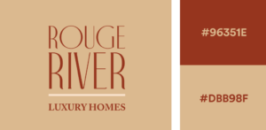 Hex Codes: Terracotta #96351E, Sand #DBB98F
Teal & lavender
This one’s an unconventional color palette, but teal and purple look great together so long as one remains the dominant color. Here, we’ve used a soft lavender to create contrast against a darker background. This color combination is moody and magical.
 Hex Codes: Purple #E2D1F9, Teal #317773
Jungle green and linen white
This exotic green and white colour scheme is streamlined, clear, and incredibly adaptable. A feeling of renewal and rejuvenation is produced when white and green are combined. A green and white colour scheme might be advantageous for brands in the medical, healthcare, and environmental awareness industries. When green and white are put together, there is a noticeable feeling of colour harmony.
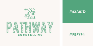 Hex codes: Green #53A57D, Linen White #FBF7F4
Cyan and bubblegum pink
A great logo colour scheme includes the bold colours cyan and hot pink. It combines elements of pop princess and cyberpunk. For more fun brands, these vivid, high-contrast hues exude an energy that is perfect. Consider scene or punk branding.
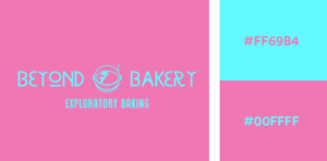 Hex codes: Hot Pink #FF69B4, Neon Blue #00FFFF
Sage green and dark purple
To establish colour harmony, you won’t need to go much farther than sage green and deep purple. One of the hues that complements purple effectively is green. When chosen in different tones, these two may be incredibly complementing colours.
Luxurious hues like purple and green give designs a boost in vigour and vigour.
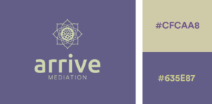 Hex codes: Sage #CFCAA8, Dark Purple #635E87
Vintage mustard and earthy greens
We have a pretty vintage colour scheme right here! forest green, sage, and vintage mustard. The ideal earthy colour palette is made up of these three hues. These hues are ideal for natural branding and appropriate for site design, package design, product design, and logo design.
 Hex codes: Mustard #E3B448, Sage #CBD18F, Forest Green #3A6B35
Creamsicle orange and yellow
A lovely orange gradient creamsicle is made of custard, peach, and pastel orange. This similar colour scheme demonstrates how nicely the colours orange and peach complement yellow. For cosmetic or clothing firms who wish to convey a joyful and serene vibe, this combination works perfectly. Use this vivacious colour scheme while making invites, Instagram posts, and posters.
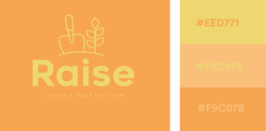 Hex codes: Pastel Orange #FFA351FF, Peach #FFBE7BFF, Custard #EED971FF